Navigation refresh
Revamped navigation for Jira and the entire Atlassian suite of products, making it intuitive and cohesive.
Timeline:
Dec '23 - Sep '24.
Product:
Jira and other Atlassian product suite.
My Role:
I was part of 4 people team what drove the end to end design for Jira and built component library and guidelines which is by other Atlassian products.
Impact:
The early release received highly positive feedback from users. Within two months of beta release, it was adopted by 1,500+ sites and 485,000 monthly active users, with only a 2.6% opt-out rate.
Overview:
Navigation is crucial in how users move across Jira, especially given the wide array of features it offers. It also plays a key role in cross-product discovery within Atlassian. In 2023, as part of the System of Work team, I contributed in revamp of Jira's navigation and developed patterns and components that now drive navigation across all Atlassian products.
Problem with current navigation:
Jira's Navigation was refreshed in 2019, and the users did not appreciate the refresh. This was rolled back within 6 months of release. Since the last major refresh, Jira's product and features have grown significantly, with several new additions. This led to few problems:
Unwieldy Navigation.
Despite having an amazing set of features and tools, they’ve become obscured by our growing list of features. And because there is such a thin connection between them, our users are not made aware of the tools that are actually within their reach. Customers may also not need some of the features on the list and yet they are always present for them to be seen.
Fragmented Experiences.
Since the last navigation refresh, Jira’s product portfolio has expanded to include Jira Work Management and Jira Product Discovery. However, these additions were made without a unified navigation framework, resulting in fragmented user experiences. This inconsistency became a major issue for users switching between products.
Multiple interaction in one.
The absence of a navigation framework resulted in multiple interaction patterns crammed into one system. It included nested menus, accordions, dropdowns, and various layouts like left-top models, creating confusion about what would occur when clicking on items.
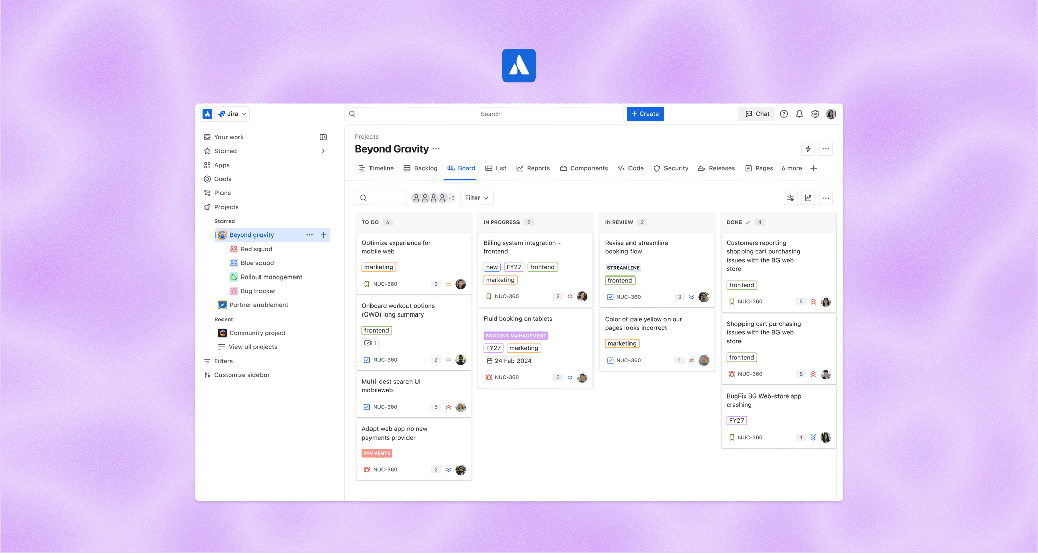
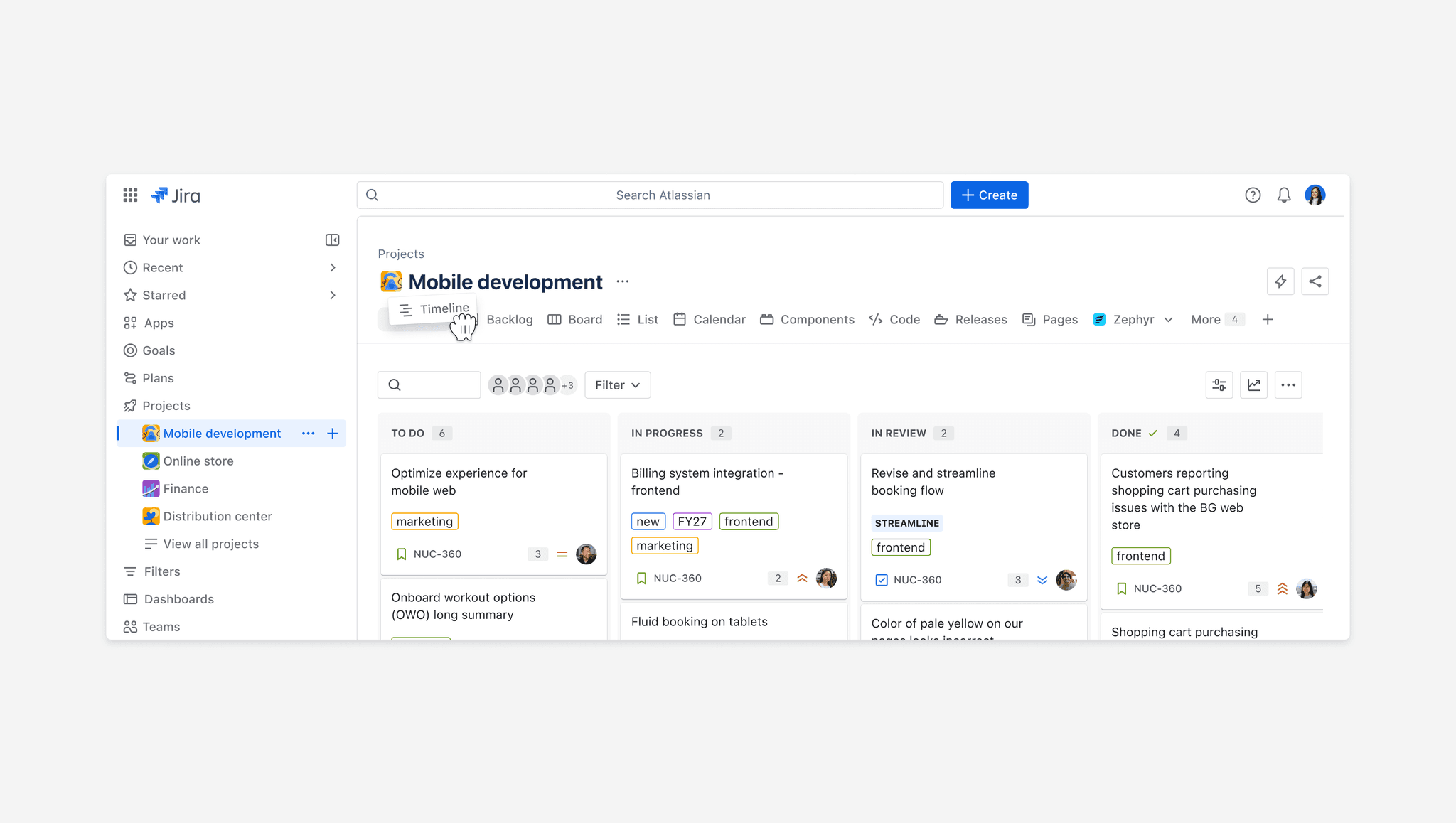
The redesign:
Navigation that simplifies our products and scales.
The navigation is a tool for users to easily access what they need, not just a simple directory.
It follows a consistent pattern, clearly defining what to expect when interacting with any item.
We designate a place in our navigation for products to live that offers space for the product to grow without bloating our front page.
The system offers robust accessibility features like keyboard navigation, screen reader support, and clear visual cues, ensuring all users, regardless of ability, can navigate in ease.
Quickly access your most important items.
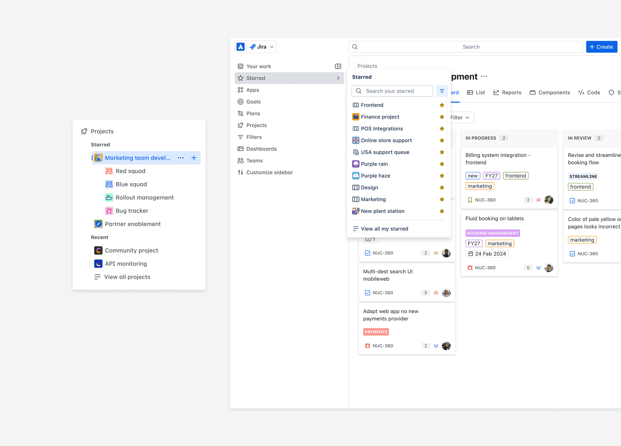
Research showed that users frequently bookmarked pages and projects for quicker access. To address this, we prioritized creating a dedicated section for starred and recent items and also each navigation section highlights these key items for easier discovery.
Navigation, the way you like it.
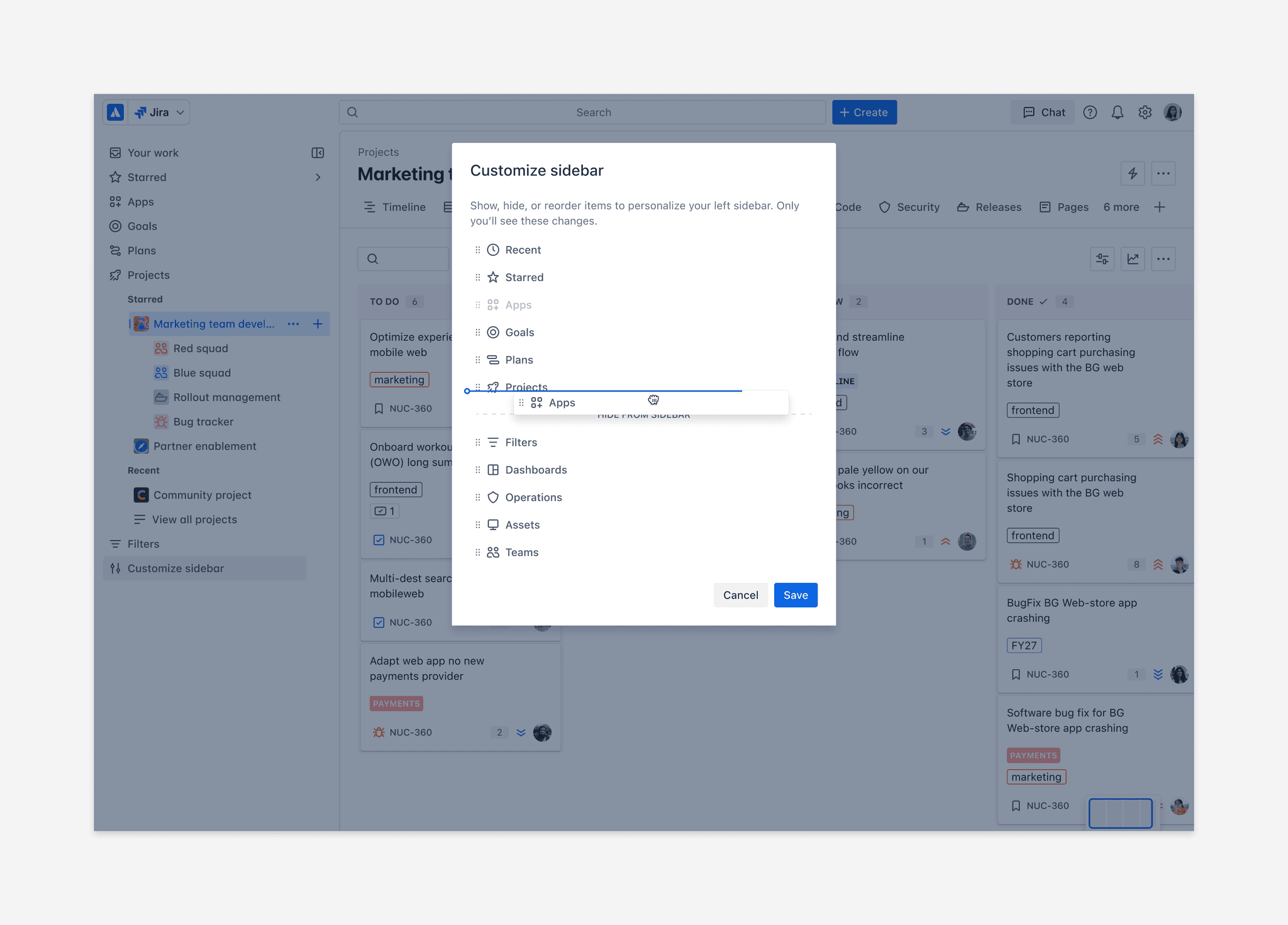
The current navigation displayed all features upfront, making it overwhelming and confusing. We've simplified it by allowing users to personalize their navigation, customizing it to fit their preferences for a more tailored experience.
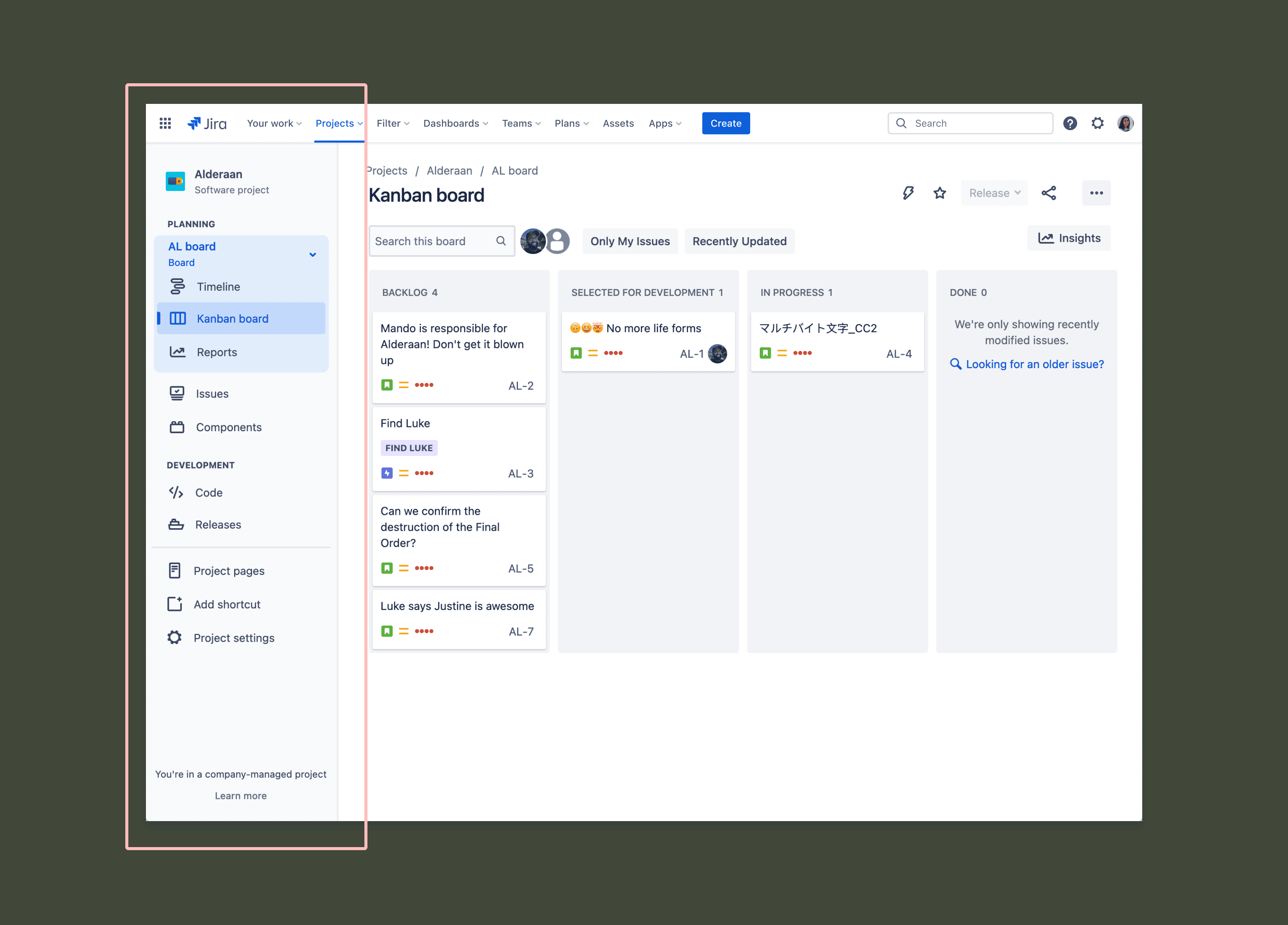
The variants:
As we finalized the navigation experience, it sparked discussions about an Atlassian-wide navigation overhaul. As a platform team to support this, we developed a navigation library, along with patterns and guidelines, enabling other products to implement and create cohesive navigation systems within their own.
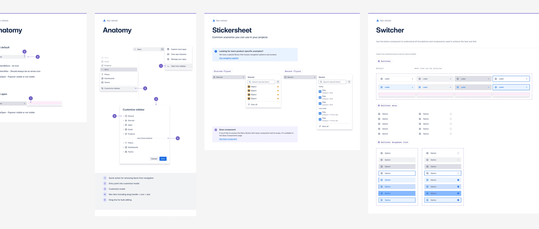
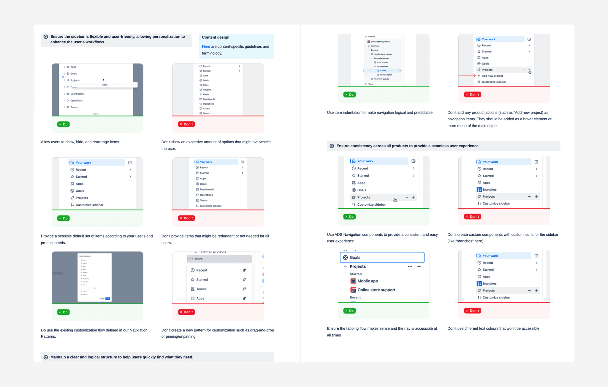
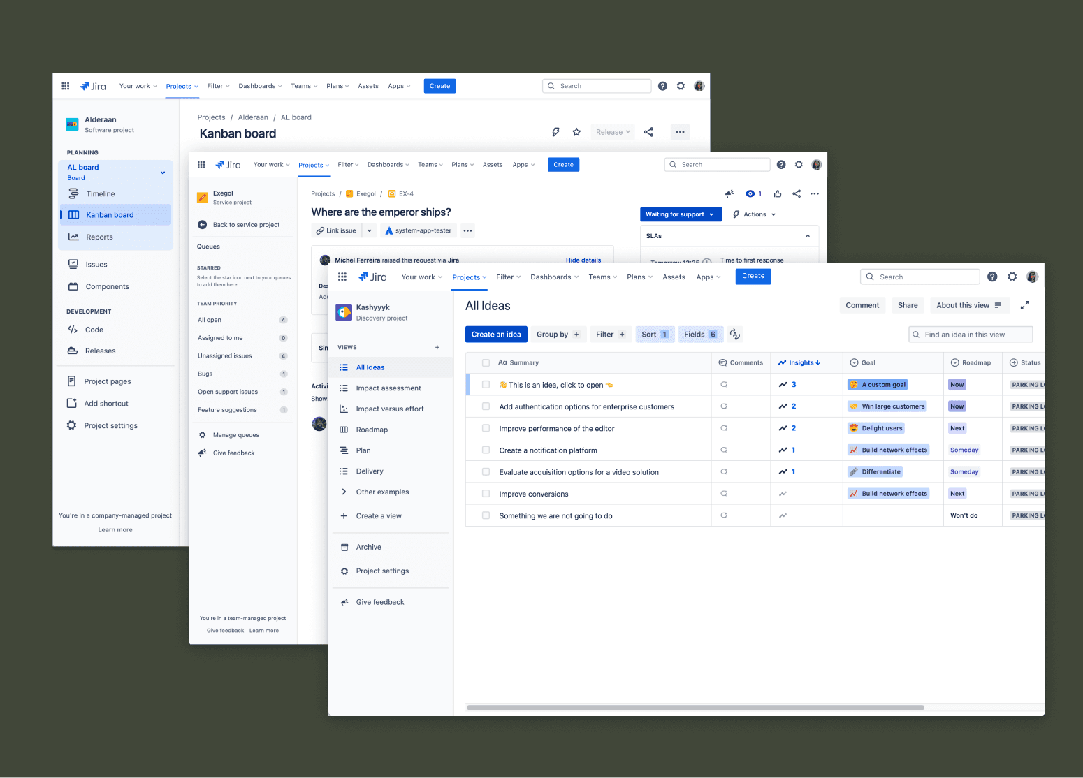
📖 Snippet of library and guidelines we built.
While developing the library and guidelines, we collaborated closely with SMEs from all Atlassian products to ensure the navigation system was consistently applied, creating a cohesive experience across the platform.
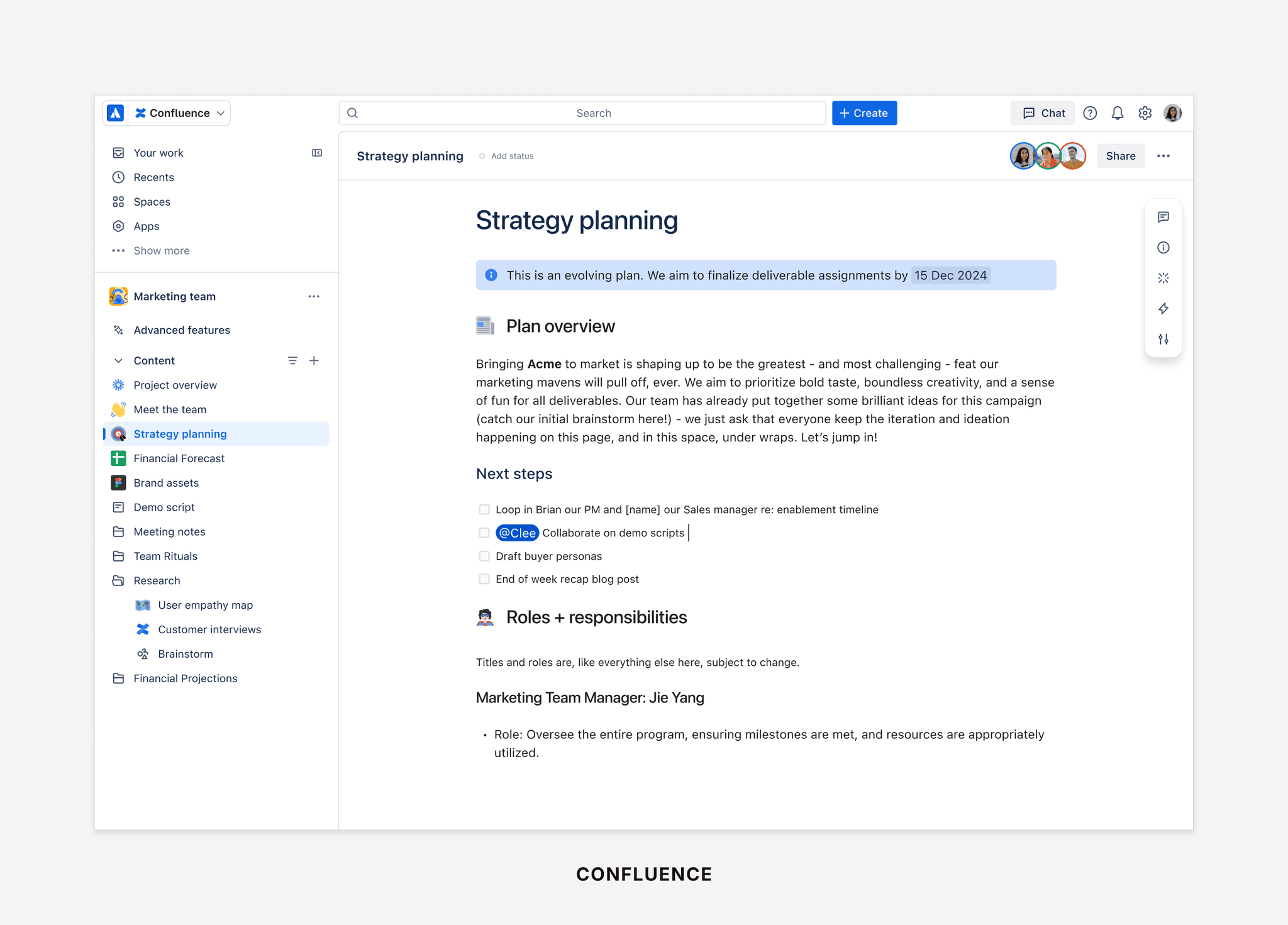
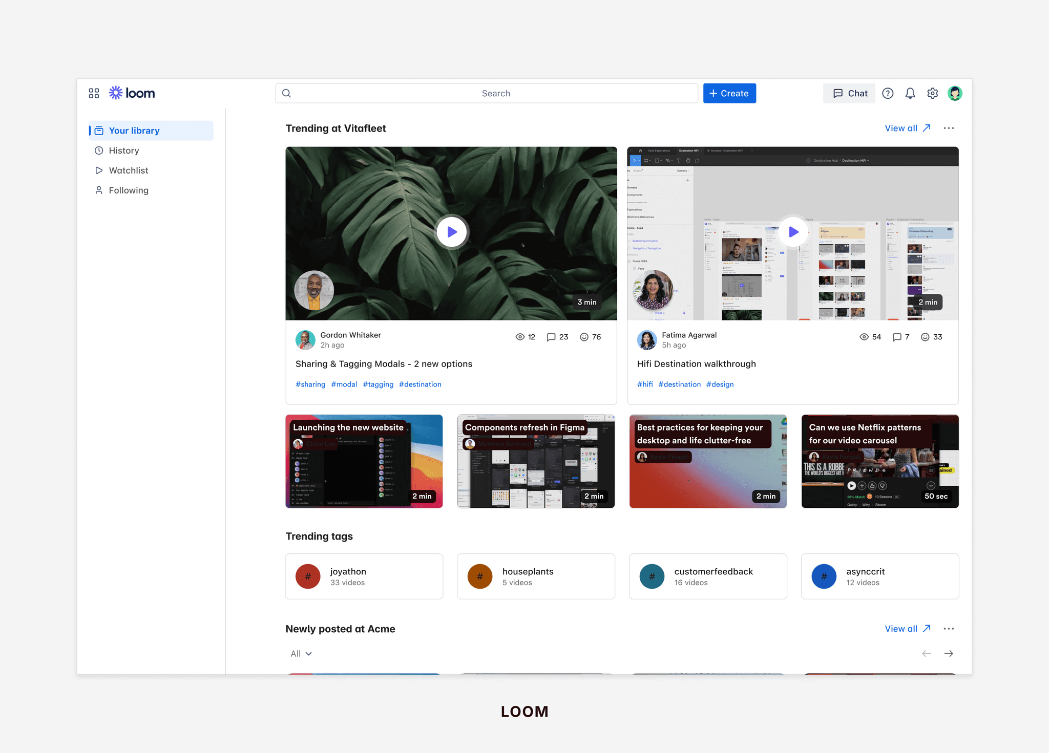

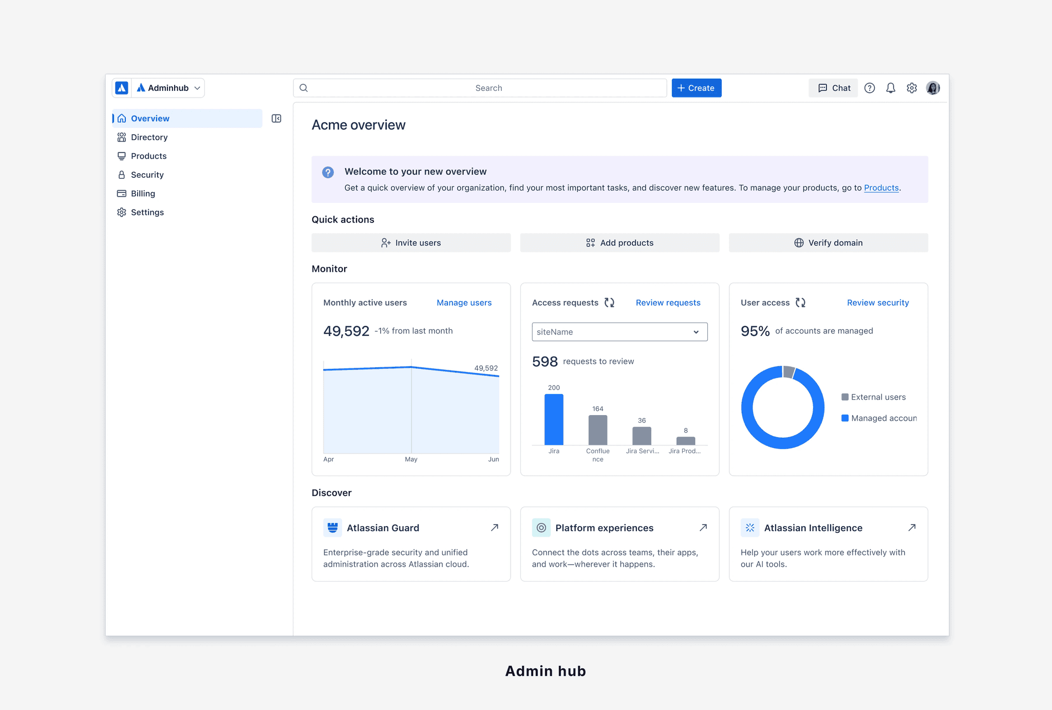
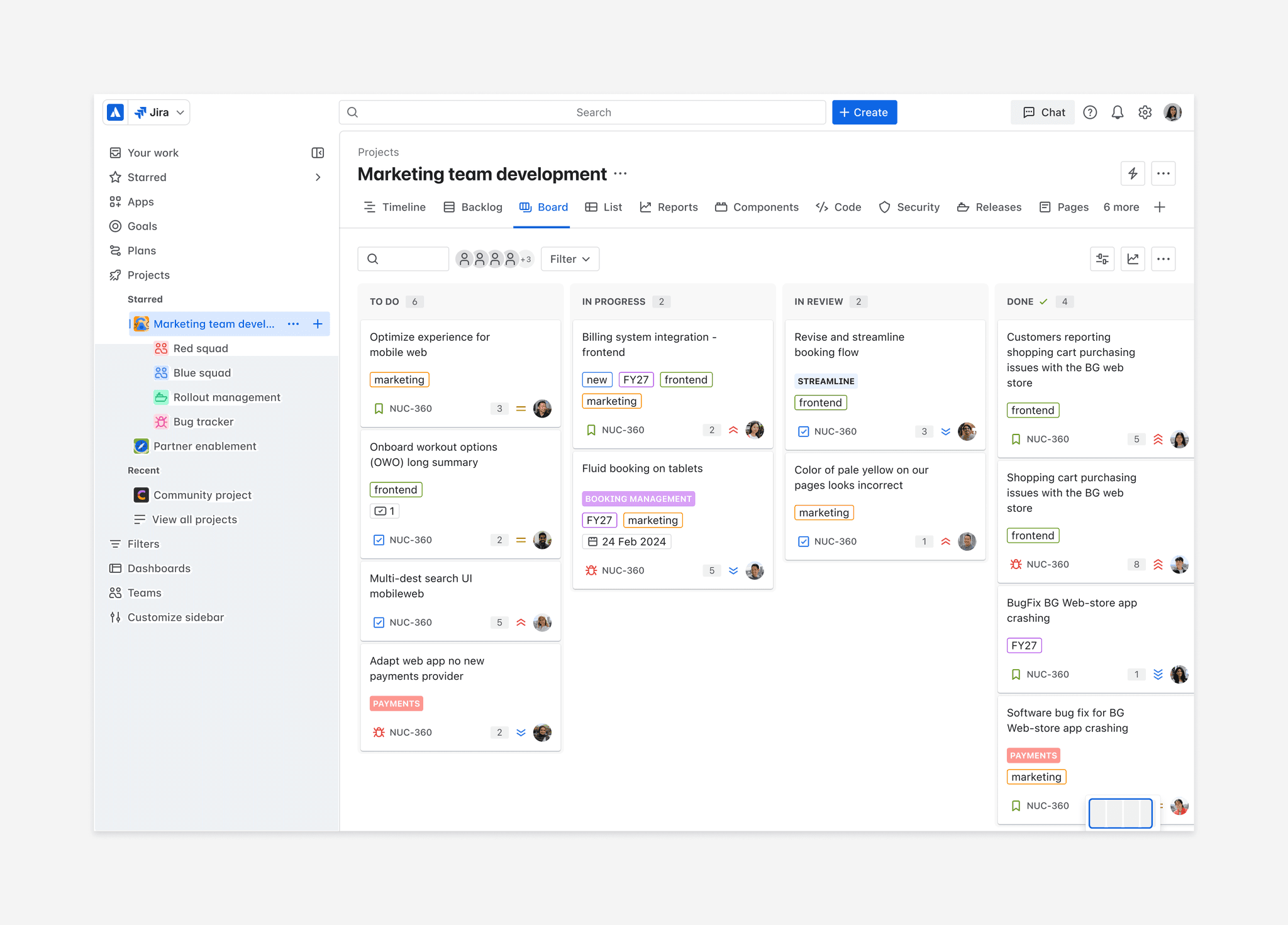
🎶 Revamped navigation for our entire suite of products!
Conclusion:
User testing and the beta release received highly positive feedback, achieving a usability score of 6.8, surpassing the company's benchmark. Within two months of beta release, it was adopted by 1,500+ sites and 485,000 monthly active users, with only a 2.6% opt-out rate.
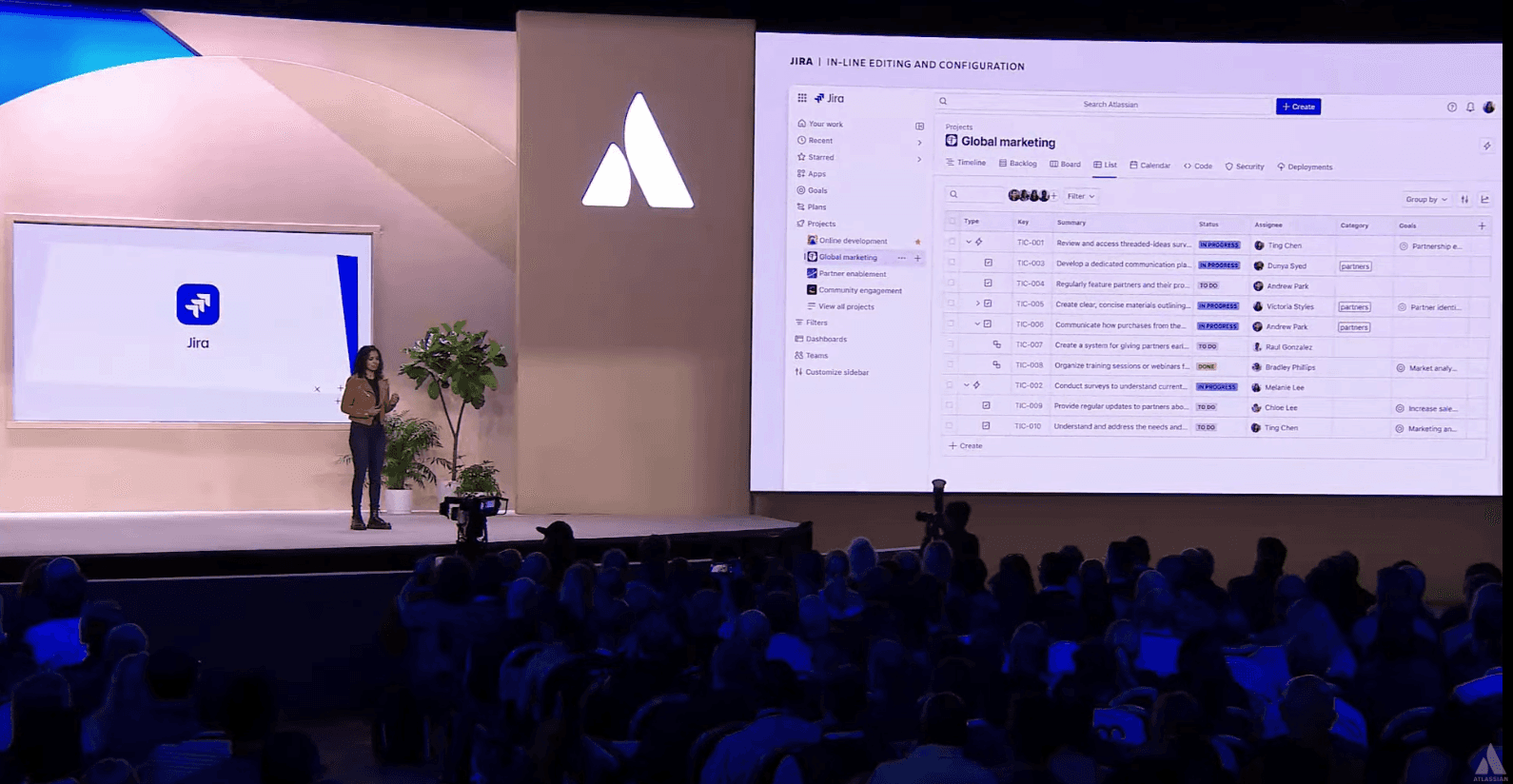
🤩 Anu showcasing new nav at TEAM24. Watch it here.
More Projects
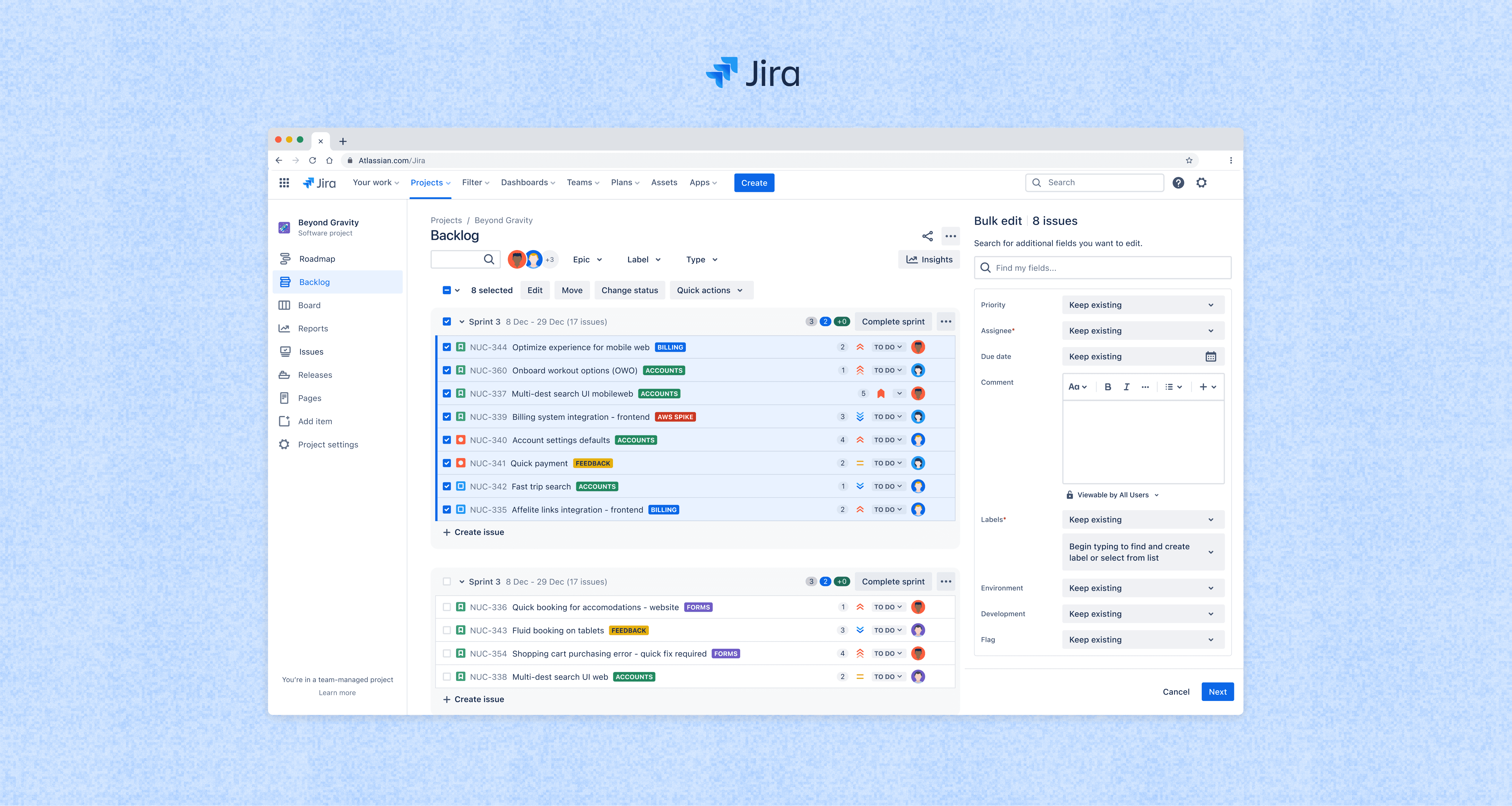
Jira's new bulk operations
Redesign of Jira's 19-year-old bulk operations feature, a core experience used to manage and update all Jira issues (tickets).
Developer portal
Experience of enabling third-party developers to create their own applications on Innovaccer's health cloud.